 By Kelvin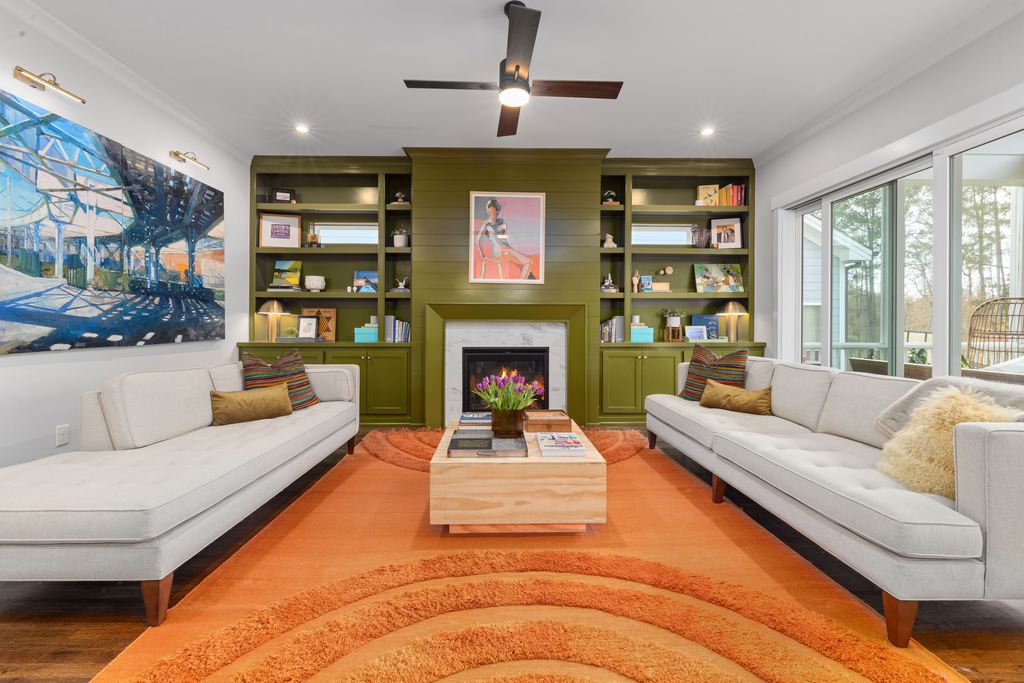
Introduction
Choosing a room color is easier when you start with how the space needs to feel, not with a paint chip or a trend. Color psychology in interior design can help you create a bedroom that feels restful, a living room that supports conversation, or a home office that feels focused without becoming sterile. This guide explains how hue, lightness, saturation, lighting, materials, and furniture work together, so you can choose a palette that fits the room’s real use instead of relying on rigid claims about what each color “means.”
Table of Contents
What Is Color Psychology in Interior Design?
In practice, this approach uses color to influence how a room is perceived and experienced. A pale dusty blue and a saturated navy are both blue, but they create very different levels of visual weight.
Color theory explains how colors relate and combine; color psychology focuses on the feelings and behaviors a palette may support. The psychology of color in interior design should be treated as a decision tool, not a universal formula. Personal history, culture, room function, and surrounding light can all change how a color feels. A review in Frontiers in Psychology likewise notes that color responses are context-dependent and should not be reduced to simple one-color, one-emotion rules.
How Do Colors Change the Mood of a Room?
The emotional effect of a room depends on four main variables: color family, lightness, saturation, and area. Warm colors such as rust, ochre, terracotta, and muted red often add energy or closeness. Cool colors such as blue, green, and blue-gray often feel quieter or more spacious. Neutrals can soften either direction, but they are not automatically calm.
Lightness controls visual weight: pale colors usually feel less enclosing, while deeper colors can feel grounded or cocooning. Saturation controls intensity; sage is easier to use across a large wall than neon green.
Use the desired mood as a starting point:
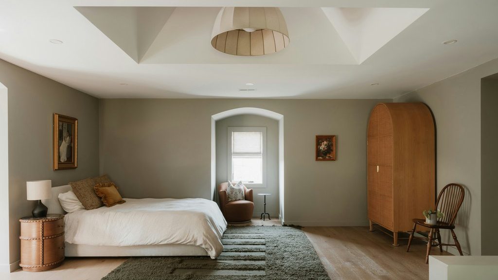
- Calm and restorative: Muted blue, sage, warm white, soft taupe
- Warm and social: Terracotta, ochre, clay, warm beige, controlled red accents
- Focused and balanced: Blue-green, olive, medium wood, low-contrast neutrals
- Cozy and intimate: Charcoal, brown, burgundy, deep blue, walnut
- Light and open: Warm white, pale greige, soft pastel, light natural wood
Area matters as much as the color itself. A mustard pillow may feel cheerful; a saturated mustard ceiling, sofa, rug, and wall can become tiring. When you want a stronger color, give it one clear job instead of repeating it across every large surface.
Which Colors Work Best for Each Room?
There is no single correct color for a bedroom, living room, dining room, or office. The better question is what activity the room must support and how much energy that activity needs. Use the table below to move from room function to a practical color direction.
| Room | Main Activity | Useful Color Direction | Where to Use It | What to Watch |
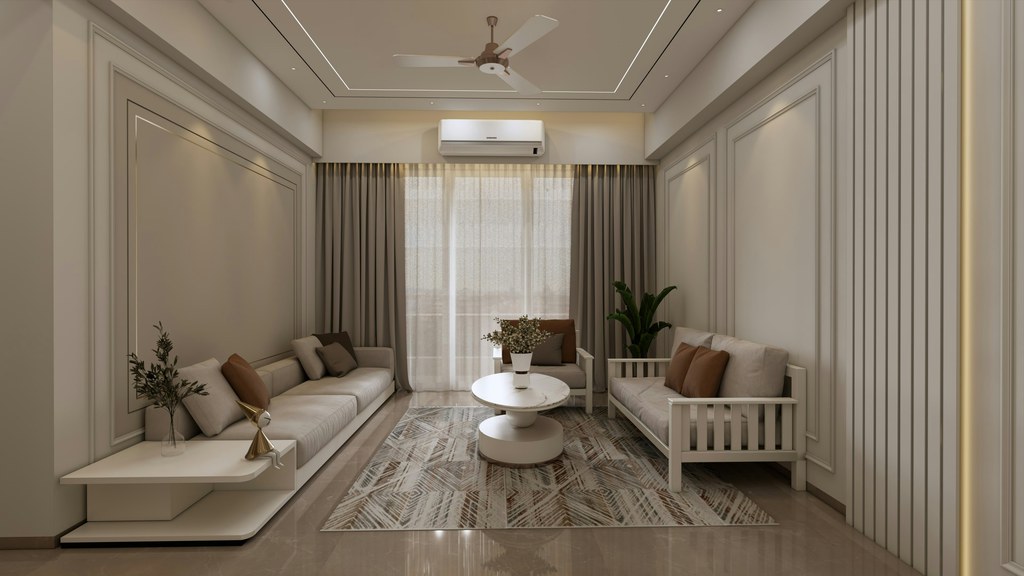
| Living room | Relaxing, talking, watching TV | Warm neutrals, muted green, gray-blue, earthy accents | Sofa, rug, media console, one wall | Too many dark blocks around the TV |
| Bedroom | Sleeping and winding down | Soft blue-green, warm beige, low-saturation deep tones | Walls, bedding, headboard, nightstands | Bright contrast directly in the sightline |
| Dining room | Eating and socializing | Warm wood, clay, muted yellow, burgundy accents | Table, chairs, sideboard, lighting | Strong warm colors on every surface |
| Home office | Concentration and video calls | Blue-green, olive, warm gray, natural wood | Wall behind desk, storage, chair, rug | Cool gray under harsh overhead light |
| Kitchen | Cooking and family activity | Warm white, pale wood, soft green, controlled accents | Cabinets, stools, backsplash, small appliances | Trend-driven cabinet colors that are hard to replace |
In a living room, the sofa and media wall usually carry more visual weight than small decor. A muted green sofa can make a cream room feel grounded, while a walnut media console can warm a blue-gray wall without adding another strong hue. More detailed living room color ideas that work with real furniture can help narrow the palette once the room’s mood is clear.
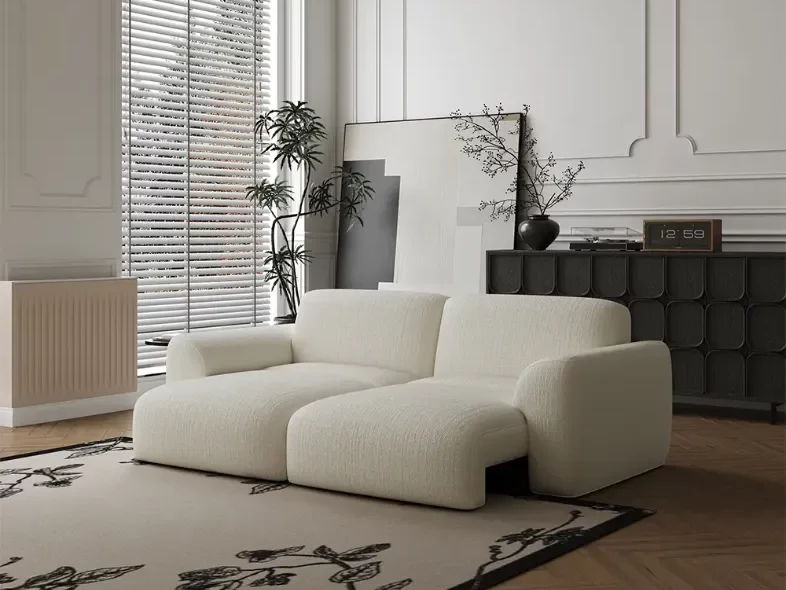
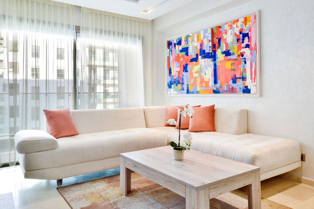
When artwork, rugs, or cabinetry already bring stronger colors into the room, the Aurora-Power Sofa Bed provides a quieter cream-white anchor. Its matte-textured chenille softens the palette without looking flat, while the motorized extendable seat supports both everyday conversation and deeper lounging without introducing another visually heavy piece.
How Do Light, Materials, and Color Area Change the Effect?
A color never appears by itself. Natural light, bulbs, finishes, and neighboring surfaces all change it. North-facing daylight often makes colors appear cooler, while strong late-afternoon light can intensify yellow, orange, and red undertones. Warm bulbs support wood, cream, clay, and brown; cooler bulbs can sharpen blue, gray, white, and green.
Materials also alter color in interior design. Velvet can deepen a jewel tone, leather develops highlights, and matte paint looks softer than gloss. Stone, glass, and polished metal reflect surrounding colors, while wood introduces yellow, red, gray, or brown undertones.
Consider a living room with cool white walls and a gray sofa. Adding more gray may not create calm; it may make the room feel flat. A walnut table, cream rug, and warm lamp can correct the temperature without changing the wall color. Learning how furniture color works with your home walls is especially useful when the flooring or sofa must stay.
Finally, compare color by area. A deep green vase is an accent. A deep green sectional is an anchor. A deep green wall becomes the background for every object placed against it. The larger the area, the more carefully you should test undertone, brightness, and evening light.
Should Color Come From Walls or Furniture?
In color psychology in interior design, the surface carrying a color matters almost as much as the hue itself. Walls establish the background, while furniture creates longer-lasting visual anchors. Decide where color should appear by considering both its visual area and how difficult the item will be to replace.
- Hard to replace: Sofa, dining table, large storage cabinet, flooring, fixed cabinetry
- Moderately easy to replace: Rug, curtains, accent chair, movable sideboard
- Easy to replace: Pillows, throws, artwork, lamps, tabletop decor
Use large furniture for colors you can live with for years, and reserve brighter coral, cobalt, yellow, or pink for pieces that are easier to update. If the room already contains a strongly colored sofa or cabinet, treat it as a fixed element. Pull one of its undertones into the wall, rug, or wood finish instead of matching the exact shade everywhere. Practical guidance on how to choose furniture color for existing rooms can help when several permanent finishes must work together.
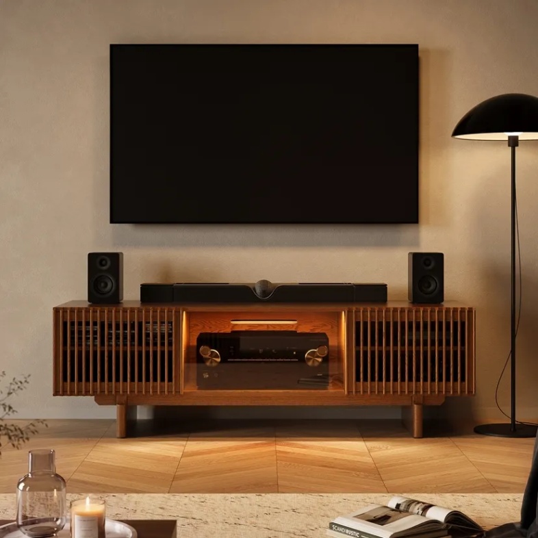
If a living room has cool walls or a gray sofa but still feels flat, the Arboren-71” Mid-Century Modern TV Stand with storage can add a stable warm note without repainting. Its walnut finish softens the palette, while three closed cabinets keep media equipment and accessories visually contained, allowing the console to support the room rather than compete with its main colors.
The 60-30-10 rule can still provide a useful visual check: roughly 60 percent background color, 30 percent supporting color, and 10 percent accent. Do not treat it as a strict calculation, since windows, flooring, wood furniture, and open-plan sightlines can already change the apparent proportions.
How Should You Test a Palette Before Buying?
Test colors beside the surfaces that will remain. A store sample cannot show how a shade will react to your floor, sofa, curtains, or bulbs.
- Define the room’s job. Write down whether the space should feel restful, social, focused, bright, or intimate.
- List fixed colors. Include flooring, countertops, a sofa, large cabinets, and window treatments you will keep.
- Check undertones together. Place paint, fabric, wood, and stone samples side by side instead of comparing them from memory.
- View them throughout the day. Check morning daylight, afternoon sun, and the bulbs used at night.
- Test the intended area. A small swatch cannot fully predict a whole wall or large sofa, so use the largest sample available.
- Start with the lowest commitment. Try an uncertain color through a pillow, throw, art print, or removable cover before using it on a major piece.
- Review furniture images carefully. Compare material close-ups, room scenes, and customer photos. Screen brightness and studio lighting can shift the apparent shade.
A couple choosing between a rust and blue accent chair may find that both work in daylight, but only rust connects with their walnut floor under evening lamps. The final decision should be based on the room at the time it is used most.
Conclusion
Color psychology in interior design works best when it starts with the room’s function and ends with a real-world test. Decide whether the space should feel calm, social, focused, open, or intimate. Then choose the color family, lightness, saturation, material, and surface area that support that goal. Treat floors and existing furniture as fixed inputs, and use lower-commitment decor to test uncertain colors. A successful palette does not follow a rigid emotional code; it fits the light, activities, materials, and people already in the room.
Q&A
Which Upholstery Colors Are More Forgiving With Kids or Pets?
Mid-tone, heathered, or subtly varied upholstery usually conceals pet hair, crumbs, and minor marks better than solid white, pale beige, or flat black. Color cannot compensate for an impractical fabric, so also check stain resistance, cleaning codes, removable covers, and whether the weave is likely to trap fur.
Should Dining Chairs Be Lighter or Darker Than the Table?
Use lighter chairs when a dark or substantial table feels visually heavy, especially in a compact dining room with limited daylight. Darker chairs can give a pale table more definition. Upholstered chairs may also appear softer and less visually dense than painted wood or metal chairs in a similar shade.
What Should You Check When Choosing the Color of a Floating Sofa?
Check the sofa from the hallway, dining area, and entrance because its back and sides remain visible. Look for consistent upholstery color, neatly finished seams, and a back panel that does not appear unfinished. The rear view should support the open layout rather than looking like a hidden side of the furniture.
Which Cabinet Colors Hide Dust and Fingerprints Better?
Medium wood tones, greige, taupe, and finishes with natural grain or subtle tonal variation generally conceal dust and fingerprints better than solid black, bright white, or very dark uniform surfaces. This matters most for media consoles, sideboards, and cabinets with doors or drawers that are handled several times a day.
Will Direct Sunlight Fade Colored Upholstery?
Yes. Extended direct sunlight can gradually fade both neutral and colored upholstery, although deep and saturated shades may show uneven fading more clearly. Check where strong afternoon sunlight falls before placing the furniture, review any available lightfastness information, and use curtains, shades, or UV-filtering window treatments to reduce exposure.


