Choosing paint sounds easy until you realize your walls affect everything else in the room. The best living room color ideas do more than look pretty on a swatch. They shape how bright the room feels, how large it looks, and how well your sofa, rug, and wood tones work together. If you want stylish but livable results, these living room paint color ideas will help you narrow your options, avoid common mistakes, and build a palette that feels right in real life.
Table of Contents
What are the best living room color ideas for a stylish home?
The best color choices usually fall into a few reliable directions. Instead of chasing every trend, start by choosing whether you want your room to feel timeless, softly layered, or bold with depth. That makes the rest of your decisions much easier.
Timeless colors that work in most living rooms
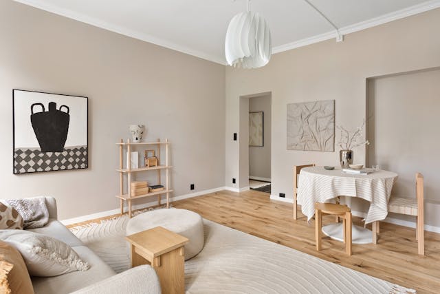
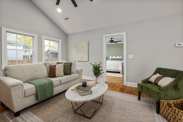
Warm white, beige, greige, and soft taupe are the easiest starting points for color ideas for living room walls because they work with more wood finishes, fabrics, and decor styles than cooler grays. They also age well. A room painted in a creamy neutral can feel calm for years, while trend-heavy shades often need updating faster.
These shades work especially well when you have:
- oak or walnut furniture
- textured rugs
- mixed metals
- family rooms that need a relaxed feel
Soft colors that add interest without feeling risky
If neutrals feel too safe, muted colors give you more personality without making the room hard to style. Sage, dusty blue, and blue-gray are especially useful when you want subtle color but still want the room to feel easy to live with. These tones are some of the most flexible living room paint color ideas for homes that mix modern and traditional pieces.
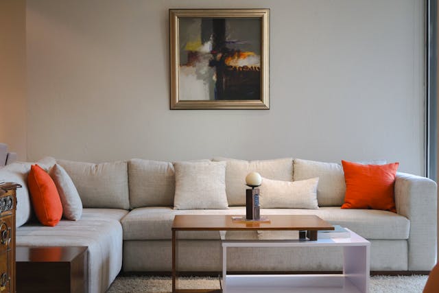
A soft cream wall also pairs beautifully with furniture that has warmth built in. A creamy seating piece such as this electric pull out sofa bed in French retro cream style keeps the palette light while adding comfort, texture, and a softer visual center through its performance chenille upholstery and extendable design.
Bold shades that still feel livable
Deeper shades can feel refined rather than heavy when the undertone is right. Navy, olive, charcoal, and muted terracotta are strong choices if you want more drama without turning the room dark and cold. Among blue living room color ideas, dusty navy is often the easiest to decorate around because it feels classic, not loud.
I once tested a muted olive wall in a room with afternoon sun and walnut shelves, and by sunset the whole space felt warmer and more expensive than the paint sample suggested. That is the magic of a color with the right undertone.
How do you choose the right color for your living room?
After you know the broad style direction you like, the next step is choosing what actually fits your room. This is where good results happen. Most people do not fail because they picked a bad trend. They fail because they skipped the room itself.
Start with light, not trend
Natural light changes everything. North-facing rooms usually benefit from warmer colors, while bright sunlit rooms can handle cooler or deeper shades. Before choosing paint, stand in the room in the morning and again in late afternoon. A color that looks clean at noon may look flat at 6 p.m.
Match your wall color to what you already have
Your floor, sofa, rug, curtains, and wood tones matter more than the latest trend list. A useful way to simplify the decision is to treat the room as one temperature family. If your furniture leans warm, warm wall colors will usually feel more connected. The same principle appears in how furniture color works with your home walls, where warm and cool finishes are matched as a system rather than as separate choices.
Choose the feeling before you choose the paint
Ask what you want the room to feel like:
- Calm and airy: warm white, pale greige, soft blue-gray
- Cozy and grounded: taupe, olive, deep beige
- Clean and modern: crisp off-white, charcoal accents, black details
- Rich and moody: navy, forest green, earthy terracotta
Here is a quick comparison to help narrow it down:
| Goal | Best Color Direction | Works Best In | Watch Out For |
| Make the room feel bigger | Warm white, soft greige, pale sage | Small or low-clutter rooms | Stark white can feel cold |
| Add warmth | Beige, taupe, sand, olive | Rooms with little sun | Too much yellow undertone |
| Create contrast | Navy, charcoal, deep blue-gray | Bright rooms with natural light | Heavy look in dark corners |
| Keep it flexible | Greige, cream, muted stone | Mixed furniture styles | Muddy undertones |
What are 7 designer-friendly living room color combinations to try?
Once you understand light, mood, and existing finishes, color combinations become much easier to use. The best ones are balanced enough for everyday life but still interesting enough to feel designed.
No.1 Warm white + beige + natural wood
This is one of the safest and best long-term combinations. It feels bright, soft, and layered rather than plain.
No.2 Greige + black accents
Greige gives you the flexibility of gray with more warmth. Black frames, lighting, or table legs add definition without making the room feel cold.
No.3 Sage green + cream
This is a favorite when you want soft color with a restful mood. It works beautifully with linen, oak, and woven textures.
No.4 Dusty blue + warm white
Among practical blue living room color ideas, this one feels especially livable. Dusty blue adds character, while warm white keeps the room from feeling too cool.
No.5 Olive + tan + brass
Olive works best when you want depth but still want the room to feel organic. Brass adds a little polish without fighting the color.
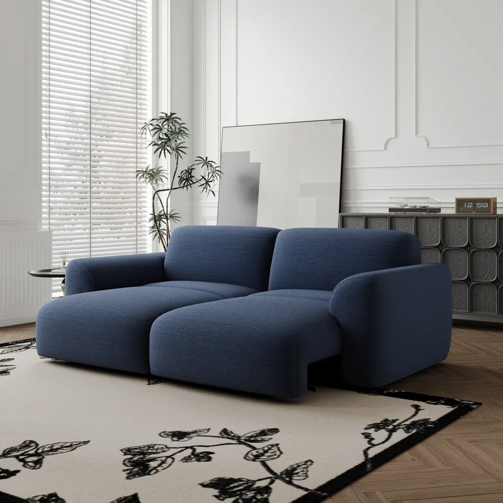
No.6 Navy + soft gray
This combination feels sharper and more tailored. It suits modern rooms, especially those with strong lighting and clean lines. A navy seating piece, like this electric pull out sofa bed, can reinforce the palette while adding softness and function without making the room feel heavy.
No.7 Terracotta + sand + walnut
Earthy but refined, this palette works well when you want warmth that feels less expected than beige alone.
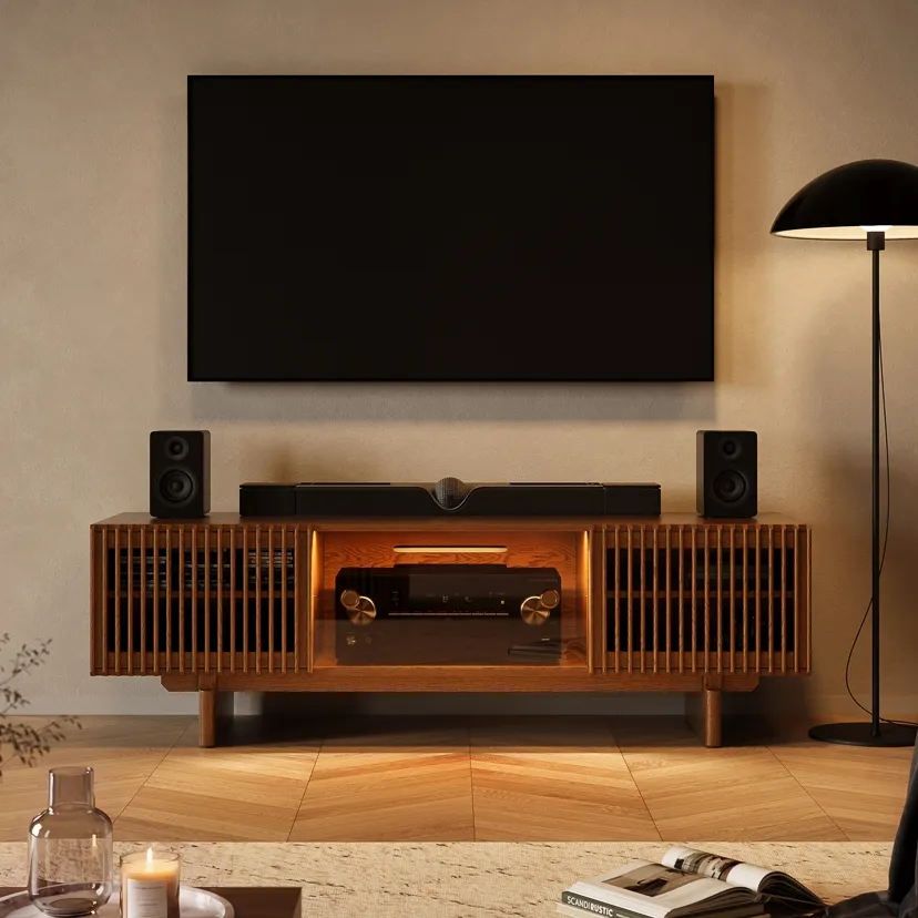
A walnut media piece can help anchor these warmer palettes. This walnut media console with slatted doors brings in natural depth, clean texture, and practical cable management, so the room reads more intentional instead of color-coordinated for its own sake.
What makes a living room feel bigger, brighter, or cozier?
At this point, color becomes less about taste and more about effect. The same paint can feel airy in one room and flat in another. If you are looking for small living room color ideas, focus on what the color does to the room, not just how it looks alone.
How lighter tones help a room feel bigger
Light tones reflect more light and reduce visual stops, which helps a room feel more open. But that does not mean every small room should be pure white. Soft greige, pale sage, and warm off-white often work better because they feel open without looking harsh.
For apartments and compact homes, the smartest small living room ideas that make a room feel open often combine light wall color with furniture that shows a little leg space and keeps the floor visible.
When deeper tones create a cozier atmosphere
If a large room feels empty or disconnected, deeper tones can help pull the walls inward visually. Olive, deep beige, and smoky blue are especially good when you want the room to feel intimate rather than bare.
On a rainy Saturday, a deeper wall color paired with a warm lamp and a textured throw can make even a simple movie night feel deliberate. The room stops feeling like unused square footage and starts feeling like somewhere you want to stay.
Why brightness is not just about choosing white
Brightness also comes from sheen, reflection, window direction, and how many dark objects the room holds. A warm white room with a dark sectional may still feel heavy. A pale beige room with a cream sofa, light rug, and walnut accents can often feel brighter overall.
Why do some living room color ideas fail in real spaces?
Online inspiration is useful, but real living rooms rarely have the same light, styling, or finishes as a photo shoot. A color that looks clean and balanced online may feel too cold, too dark, or slightly off once it sits next to your flooring, sofa, and everyday lighting. In most cases, color problems come from mismatched undertones, changing light, or trying to use too many statement shades at once. The safest approach is to choose one main wall direction, compare it with your largest furniture pieces, and test it at different times of day before painting the whole room.
Keep this in mind before you decide:
- test paint on more than one wall
- check it in natural and artificial light
- compare it with your sofa, rug, and flooring
- keep the palette focused instead of overly busy
If you are also reworking furniture placement, balanced living room layout ideas for better flow help color feel calmer because the eye moves through the room in a clearer way.
Conclusion
The best living room color ideas are not the loudest or the trendiest. They are the ones that work with your light, your furniture, and the way you want the room to feel every day. Start with mood, check your undertones, and narrow your choices before you paint. Whether you lean toward warm neutrals, muted greens, or soft blues, a thoughtful palette will always outperform a random trend. Good color should make the room easier to live in, not harder to style.
FAQ
What wall color works best with a brown leather sofa?
Warm white, greige, soft taupe, and muted olive usually work best. They balance the richness of leather without making the room feel too dark. Avoid icy gray unless the room has lots of strong natural light and cooler finishes elsewhere.
Should the living room and hallway be the same color?
Not always, but they should relate. If the spaces connect visually, use colors with similar undertones. That keeps the transition smooth. You can shift lighter or darker between rooms without making the house feel chopped up.
Is matte or eggshell better for living room walls?
Eggshell is often the safer choice for living rooms because it is easier to wipe clean and reflects a little light. Matte can look beautiful, but it tends to mark more easily in busy family spaces.
How many paint samples should I test first?
Start with three. More than that usually creates confusion. Choose one safe option, one slightly warmer or cooler option, and one bolder choice. Test each on different walls and look at them morning, afternoon, and evening.