 By Stephanie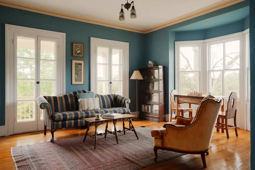
A color drenching living room can feel calm and cohesive, but covering more surfaces with one hue changes how every large object in the room reads. The sofa may suddenly feel heavier, a black TV can dominate the wall, and an open-plan layout may leave you wondering where the paint should stop. This guide focuses on those practical decisions: how far to carry the color, how to judge the room’s light and scale, and whether furniture should blend in, create tonal depth, or deliberately break the palette.
Table of Contents
Which Surfaces Should You Color Drench in a Living Room?
If you are deciding how to color drench a living room, start by defining the visual envelope rather than assuming every visible surface needs paint. Walls, ceilings, trim, and doors can create continuity, but natural materials and architectural features sometimes work better as intentional breaks.
Decide What Belongs Inside the Color Envelope
Walls are the starting point, but the immersive effect becomes stronger when the same hue continues across the ceiling, baseboards, crown molding, and painted doors. Keeping these architectural edges in one color reduces the sharp visual breaks created by conventional white trim.
That does not mean every surface needs exactly the same finish. A slightly different sheen on trim or doors can catch light differently while keeping the color consistent. The goal is visual continuity, not making every surface look identical.
Decide Which Materials Should Stay Unpainted
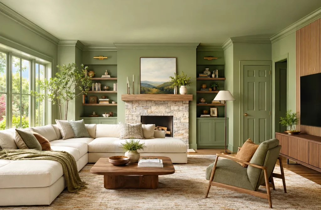
Natural wood, stone, brick, and distinctive built-ins can stay visible when they already contribute useful texture or architectural character. Painting them just to make the drench more complete can remove some of the depth the room needs.
A useful rule is simple: paint architectural surfaces that interrupt the color unintentionally, but keep materials that create a deliberate visual break. A stone fireplace or walnut wall panel can ground a saturated green or blue room without weakening the overall effect.
Will Color Drenching Make Your Living Room Feel Smaller?
Not necessarily. A continuous color can reduce the visual boundaries between walls, trim, and ceiling, but the room may still feel heavy if it combines low daylight, a dark ceiling, and several bulky pieces of furniture. Judge those conditions together instead of assuming that dark paint automatically makes a small room feel smaller.
Judge Room Size, Ceiling Height, and Daylight Together
A compact living room with generous windows can often handle a deeper color more comfortably than a larger room with weak daylight. Ceiling height matters too: carrying a very dark shade onto a low ceiling can feel much more enclosed when the room already receives little natural light.
Before committing, paint a large sample on at least two adjoining walls and look at the wall-to-ceiling transition. Check it beside the flooring and your largest existing furniture piece rather than viewing the paint sample by itself.
If the room already has a dark sofa, dark rug, and large black TV, a medium-depth wall color may give you the enveloping effect without concentrating too much visual weight in the same space.
Test the Room at Its Darkest Time
Do not judge the color only in bright afternoon light. Test it during the darkest period when the room is normally occupied.
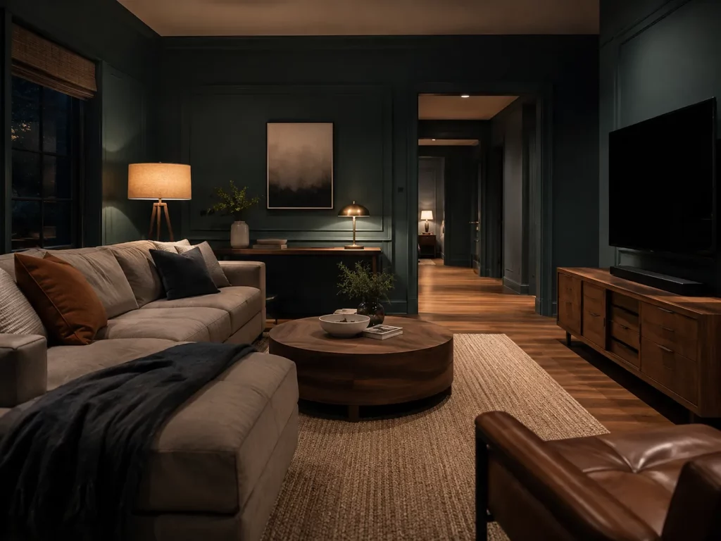
For a family room used for evening TV, look at how easily you can distinguish the sofa, floor, media console, and walkways once the windows go dark. If most of those surfaces merge into one heavy block, change the furniture contrast or lighting before abandoning the drenching concept.
This is especially important with matte, saturated paint because its daytime appearance may not predict how dense the room feels under lamps alone.
How Should Furniture Work With Color-Drenched Walls?
Once the painted envelope is established, furniture determines whether the room feels layered or flat. Start with the largest pieces rather than pillows and accessories. Each major item should have a clear role: blend into the background, create tonal separation, provide controlled contrast, or introduce a natural material break.
Start With Furniture Visual Weight
Color is only part of visual weight. Size, depth, shape, floor clearance, and material all affect how dominant a piece feels.
A large sofa placed against a similarly dark wall can become quieter because the colors visually merge, but its physical footprint still matters. If both the sofa and media unit are substantial, giving one of them a lighter color or warmer material helps prevent all the visual mass from collecting around the lower half of the room.
The POVISON Arlo navy blue velvet sofa works well when the sofa itself needs to anchor a tonal room. At 85.4 inches wide and 55.1 inches deep, it has substantial visual and physical presence, while adjustable cushions shift between more upright support and deeper lounging. The blue velvet adds a soft sheen against matte navy or teal walls, creating separation without introducing another major color.
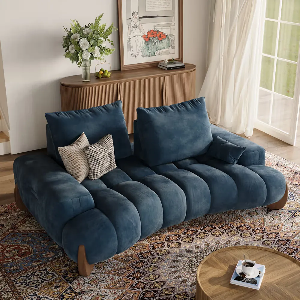
Arlo Navy Blue Velvet Sofa
Use it when you want the sofa to belong to a navy or teal palette rather than stand apart from it. The result feels more immersive while the seating still holds its own visually.
Choose Between Blend, Tone, and Contrast
Do not automatically choose a sofa that matches the wall. Decide what you want the largest upholstered piece to do.
| Furniture role | Sofa approach | Works well when | Watch for |
| Blend | Close to the wall hue | You want the sofa to visually recede | Similar surfaces can look flat |
| Tone | Same color family, different value | You want depth without adding another major color | Undertones still need to coordinate |
| Contrast | Cream or noticeably lighter upholstery | The painted envelope already feels visually heavy | Very strong contrast can weaken the immersive effect |
| Material break | Keep upholstery restrained and add wood case goods | The room needs warmth or separation around electronics | Too many unrelated wood tones create clutter |
The POVISON Avelune cream chenille sofa measures 98.43 inches wide and 48.62 inches deep, so it has a substantial presence in the room. Against deep green, blue, or warm brown walls, the cream upholstery creates a lighter visual break without competing with the color-drenched backdrop. Its adjustable backrest provides extra lounging depth, while splash-resistant chenille makes the light upholstery more practical for everyday use.
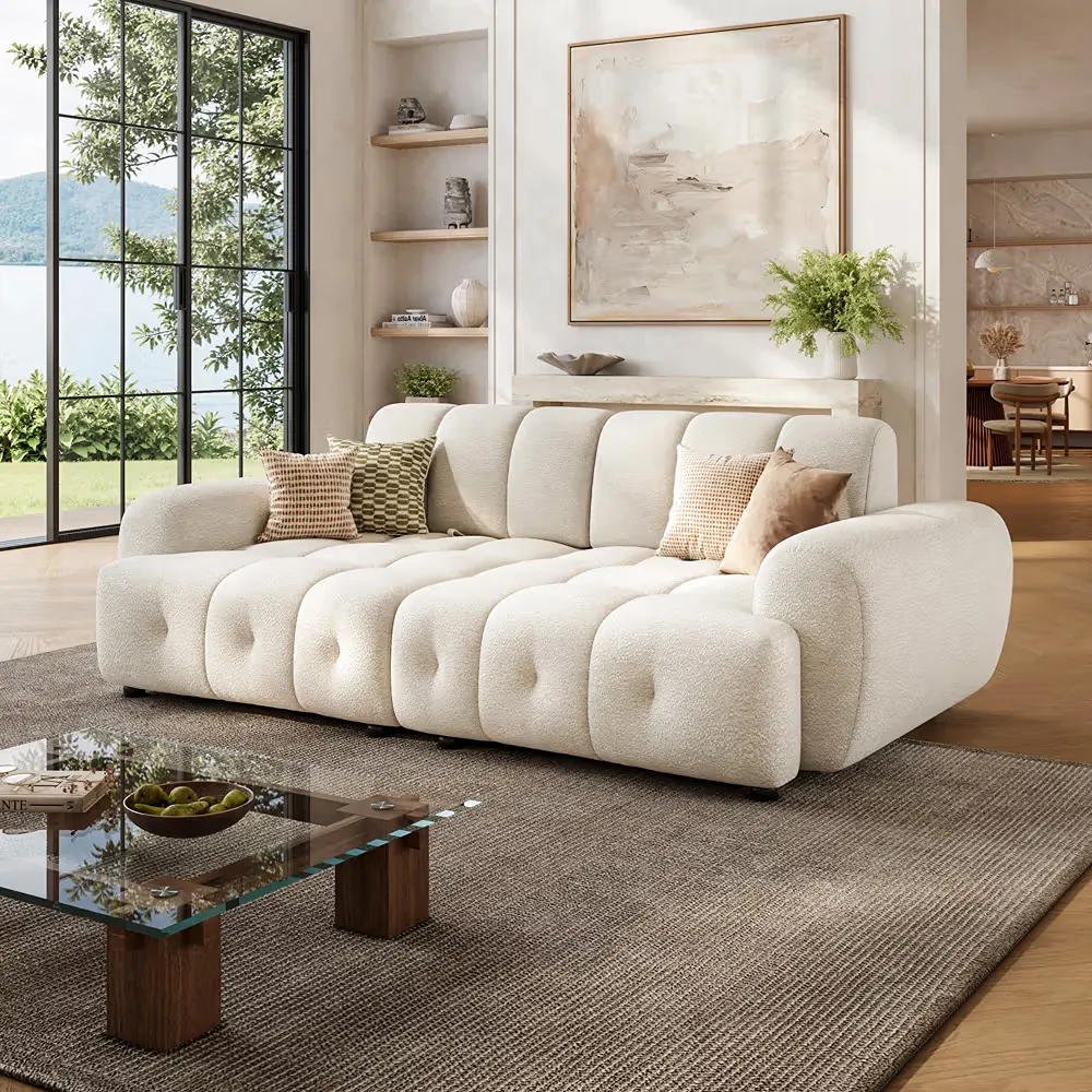
Avelune Cream Chenille Sofa
A cream sofa works well when saturated walls already carry most of the room’s color. It keeps the seating easy to see without introducing another strong accent.
Use Wood Furniture to Bridge the Palette
Wood furniture can connect saturated paint to upholstery and electronics without introducing another dominant color. Walnut is particularly useful beside greens, blues, warm taupes, and clay tones because the visible grain adds variation while the brown undertone keeps the palette grounded.
Repeat the main wood direction rather than introducing several unrelated finishes. If flooring, tables, and cabinetry already vary, deciding how to mix wood tones in a living room around a dominant undertone keeps that material break intentional instead of busy.
How Do You Color Drench Around Furniture You Already Own?
Most living rooms do not start as empty shells. If you already own the sofa, media console, or other large pieces, use them to narrow the paint direction instead of treating them as accessories you will solve later. The largest existing surfaces should tell you whether the room needs tonal continuity, more contrast, or a material break.
| What You Already Have | Paint Direction | What to Keep Simple | Why It Works |
| Cream sofa + warm oak floor | Muted olive, teal, or warm taupe | Rug and curtains | Light upholstery offsets the stronger painted envelope |
| Green or blue sofa | Same hue family, clearly lighter or darker | Secondary seating | Creates tonal depth without adding another main color |
| Walnut furniture | Green, blue, clay, or taupe | Additional wood finishes | Walnut becomes a consistent material break |
| Black TV + walnut console | Deep teal, navy, or muted green | Decor around the screen | Darker walls reduce screen contrast while wood separates the TV from the wall |
Before repainting, place a large paint sample behind the furniture you intend to keep. Judge the combination as a group, especially after sunset. A wall color that looks balanced on its own may behave very differently once it sits behind an 8-foot sofa or a large black screen.
How Do You Handle a TV Wall in a Color-Drenched Room?
A large black TV can become the strongest rectangle in an otherwise continuous room, so the media wall needs a different decision than the sofa. Decide whether the console should visually disappear, connect the screen to the room, or create a warmer break beneath it.
With navy, charcoal, or deep teal walls, a darker media unit can reduce contrast around the television. With green, blue, or other saturated walls, walnut can soften the transition between the black screen and the painted background.
The POVISON Eos walnut TV stand gives a saturated media wall a warm material break beneath the black screen. Its ash tambour doors add visible grain and allow signals to pass through, while three cabinets and two internal plus one rear cable opening keep equipment and wiring contained. The published 250-pound desktop capacity also provides a clearly documented support limit for heavier TV setups.
Keep the area around the screen quieter once those major pieces are resolved. Several small, bright accessories can reintroduce the visual fragmentation that color drenching was meant to reduce.
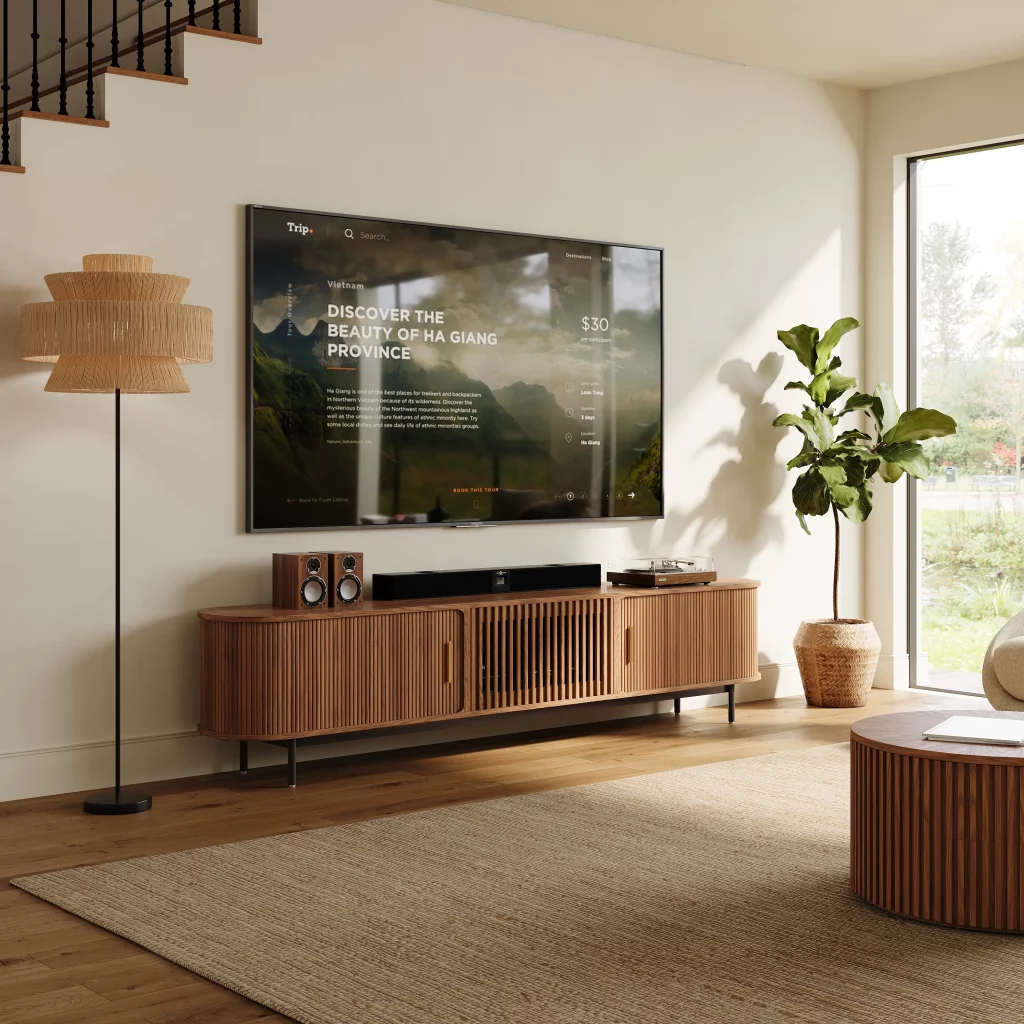
Eos Walnut TV Stand
Walnut can soften the transition between a black screen and a saturated wall, giving the media area a warmer, more grounded look without making the console another focal point.
Where Should Color Drenching Stop in Open-Plan Spaces?
In an open-plan home, let architecture determine where the painted envelope ends. A doorway, wall return, beam, ceiling change, built-in edge, or clear material transition provides a natural stopping point.
Avoid ending a strong color halfway across an uninterrupted wall simply because the sofa or dining table happens to sit there. Furniture layouts change more easily than architectural boundaries.
When the living and dining areas share one continuous shell, there are three workable approaches:
- Carry the same hue through both zones when you want them to read as one space.
- Shift to a lighter or darker version of the same hue at a clear structural transition.
- Limit the drench to a room or alcove with a defined architectural edge.
Furniture can still separate activities without requiring another wall color. A sofa back, rug, console, or lighting change can distinguish the seating area. The same principle used to decorate an open-plan apartment with furniture lets function change while the larger visual envelope stays connected.
Conclusion
A successful color drenching living room comes from deciding what should blend in and what should stand apart. Let the room’s architecture set the color boundary, then use furniture, wood finishes, and the TV wall to control visual weight and contrast. If you are furnishing the room from scratch or replacing several major pieces, POVISON can be a practical place to coordinate sofas and media furniture within the same overall design direction without making every piece look overly matched.
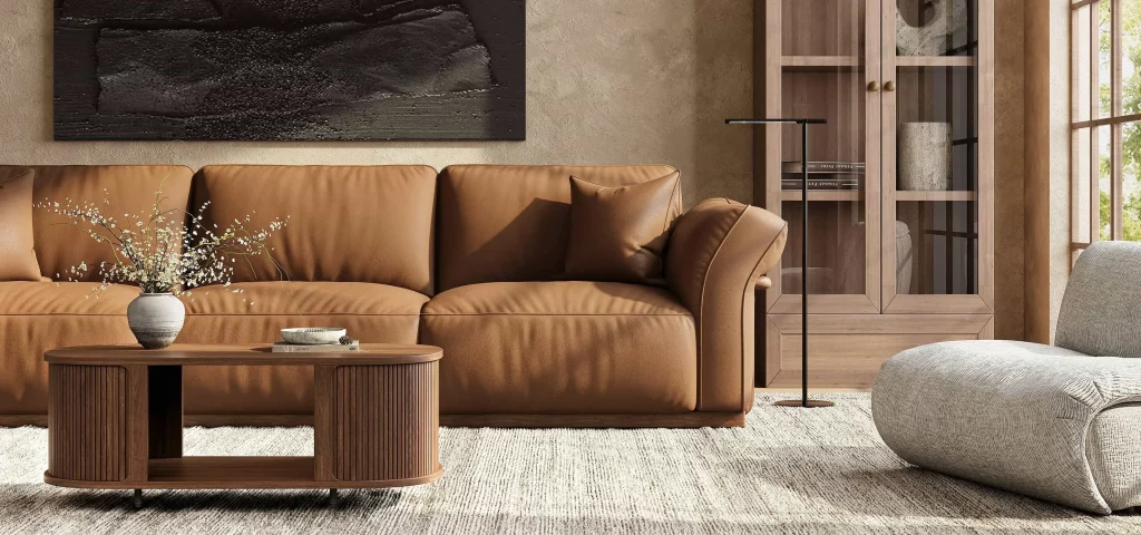
Explore More from POVISON
Browse fully assembled furniture for a cohesive living room with the right balance of color, contrast, and everyday function.
Q&A
Should Curtains Match Color-Drenched Walls?
Not exactly. Curtains in the same color family extend the enveloping effect, while a lighter or darker version gives the windows more definition. Use a strongly contrasting curtain only when you intentionally want the window wall to become a focal point rather than blend into the painted envelope.
What Rug Works in a Color-Drenched Living Room?
Let the rug create separation where the room needs it. When the sofa and walls are close in color, choose a rug with noticeably different value or texture. If the sofa already contrasts with the walls, a quieter neutral or tonal rug usually keeps the seating area from becoming too busy.
Can You Use Two Shades for Color Drenching?
Yes. Two closely related shades can preserve the immersive effect while creating more depth between walls, trim, or the ceiling. Keep their undertones consistent and make the difference visible enough to look deliberate; two nearly matching colors can otherwise read as an inaccurate paint match rather than intentional tonal variation.
Is Color Drenching a Good Idea Before Selling a Home?
Consider how soon you plan to sell and how saturated the treatment is. A deep full-room color may appeal to a narrower group of buyers and require repainting later. If resale is near, a softer midtone can preserve continuity while making the room easier for different buyers to picture themselves in.


