In 2026, the kitchen is no longer just a cooking zone—it’s a social hub, a work corner, and a family gathering space. The kitchen furniture color combination you choose for cabinets, tables, islands, and storage now sets the emotional tone for all of that. Designers are moving toward warm minimalism, earthy palettes, and sustainable, fully-assembled furniture that looks curated from day one. (New Home Source) In this guide, you’ll get ready-to-copy color combos plus practical tips to pick a palette that actually works in your real home.
How to Choose a Kitchen Furniture Color Combination That Actually Works
Read Your Space First – Light, Layout & Existing Surfaces
Before you fall in love with a mood-board, stand in your kitchen and study the light. North-facing rooms and cool LED bulbs make colors read bluer; south-facing spaces and warm bulbs soften whites and make beiges glow. Then look at what won’t change soon: floor, backsplash, countertop, and appliances. Your kitchen furniture color combination needs to complement these, not fight them. A simple rule is to pick one base color (often a neutral for cabinets), one secondary color (wood tone or upholstery), and one accent tone (hardware or chairs) to keep everything cohesive instead of chaotic.
Color Theory for Kitchen Furniture (Undertones, Contrast, Temperature)
Warm colors—creams, beiges, honey woods, terracotta—create appetite and coziness, while cooler tones like blue-grey or charcoal feel calm and sleek. Most “neutrals” have hidden undertones: whites can lean yellow or grey; greige may hide green or purple. Always test swatches next to each other, because undertones decide whether pieces look curated or “off.” Use high contrast (dark island, light cabinets) when you want drama and clear zoning, and low contrast (similar-toned wood and cabinets) when you want a soft, minimalist flow that feels more spacious.
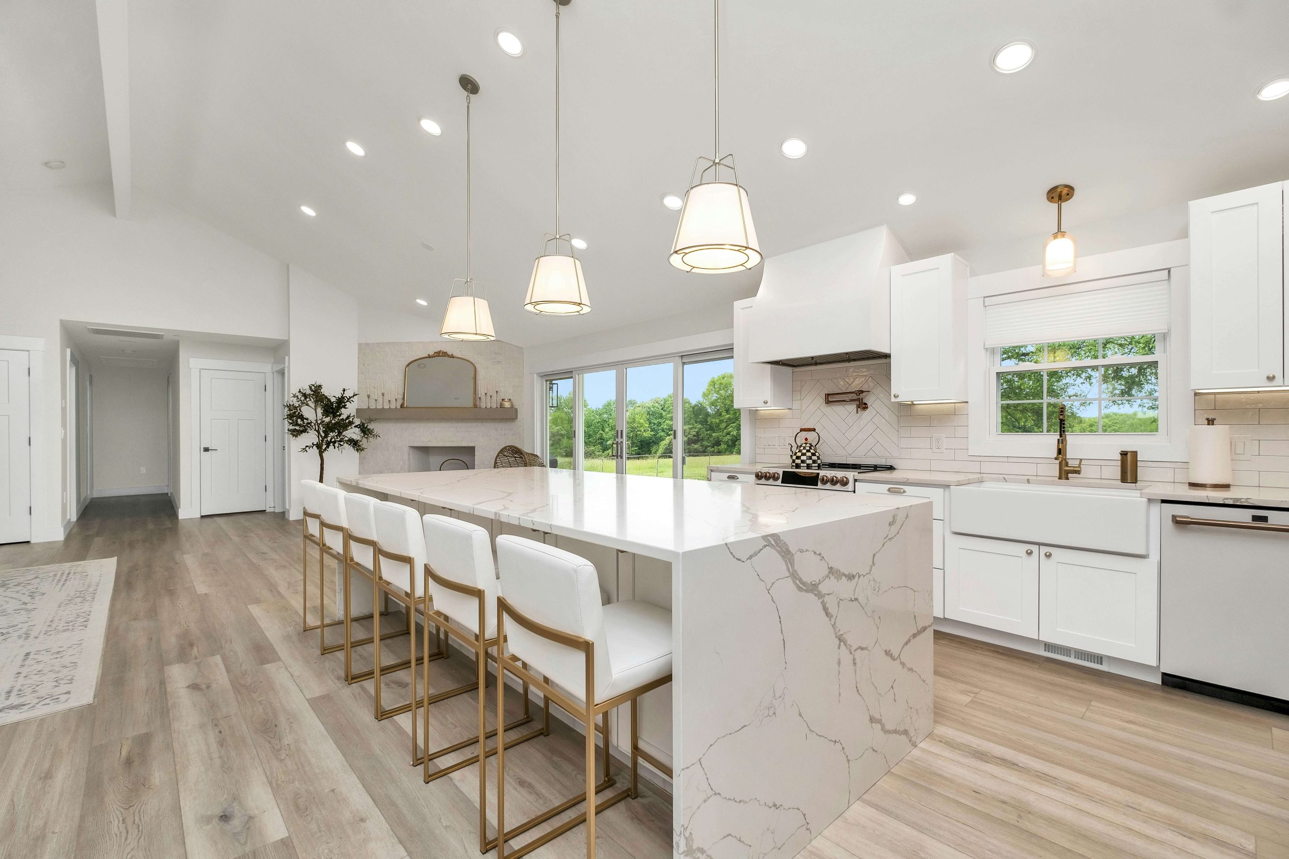
Best Kitchen Furniture Color Combinations for Neutral & Minimalist Kitchens
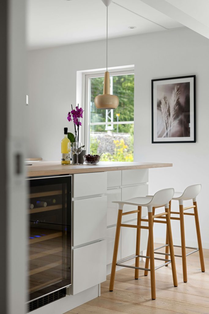
Soft White + Light Wood + Warm Beige (Scandi-Modern Classic)
If you want a calm, Instagram-ready space, this is the easiest color combination for kitchen furniture to love. Think soft white cabinets, a light oak dining table, and warm beige or oatmeal-toned chairs. NKBA research shows that designers are prioritizing warm whites and light wood tones to create a natural, harmonious feel over the next few years (NKBA, 2024). (Hartson-Kennedy) This palette hides everyday dust, works with both black and stainless appliances, and pairs beautifully with simple greenery or linen textiles.
Greige Cabinets + Black Accents + Natural Wood
Greige (a warm grey-beige) is the modern neutral that doesn’t feel cold. Use it on cabinets or main storage, then layer in black metal legs, pulls, or light fixtures for a crisp edge. A natural wood table or bar stool seats keep the room from feeling too strict. Houzz data shows that white is still the top choice for upper cabinets, but wood tones are now the most popular option for lowers, chosen by 28% of renovating homeowners (Houzz, 2024 U.S. Kitchen Trends Study). Greige plus wood lets you tap into that trend without committing to stark white.
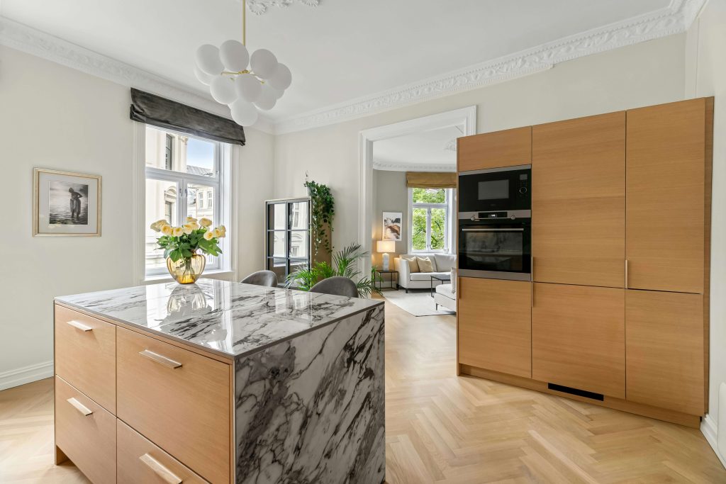
Taupe & Stone: Taupe Furniture + Stone-Look Surfaces
Taupe furniture with sintered stone countertops or tabletops creates a quietly luxurious mood. Choose matte taupe for cabinets or a sideboard, and pair it with a stone or stone-effect surface that has subtle veining in warm grey or cream. This works especially well in open-plan spaces where you don’t want the kitchen shouting for attention. It’s the kind of palette that lets you swap decor seasonally—rust linen in fall, cool blues in summer—without ever clashing with the base scheme.
Best Kitchen Furniture Color Combinations for Warm & Cozy Family Kitchens
Honey Oak + Cream + Matte Black Details
For a family kitchen that feels welcoming from breakfast to late-night snacks, honey oak plus cream and matte black is a winner. Try a honey oak table or island, cream or ivory chairs, and black for chair legs, pulls, and light fixtures. It reads warm and current, not rustic. In a real-life scenario, imagine kids doing homework at a honey oak island while a friend leans on the matte black stool—everything wipes clean quickly, and the soft cream tones hide stray fingerprints between deep cleans. Durable, satin finishes and textured fabrics help this palette stand up to busy family life.
Walnut + Terracotta + Linen Beige
Rich walnut furniture immediately adds depth; pairing it with terracotta-toned stools or cushions and linen-beige cabinets creates a “grown-up cozy” vibe. This is ideal for open kitchens flowing into a living room because the palette echoes what’s trending across interiors: earthy browns and clay-like hues instead of cool greys (Wall Street Journal, 2025). To avoid heaviness, keep upper cabinets light—off-white or pale beige—and choose warm white wall paint so the walnut and terracotta feel enveloping, not gloomy.
Earthy, Mess-Friendly Palettes for Busy Kitchens
If your kitchen sees constant action, choose colors that forgive real life. Mushroom-colored cabinets, medium oak tables, and dark bronze or graphite hardware hide smudges and minor dings. Camel-toned chair seats with oak backs, paired with a charcoal base on the table, disguise spills better than pure white. Use darker tones on high-touch areas like chair seats and table bases, and stay lighter on tabletops and upper cabinets so the room doesn’t shrink visually. This is the “no panic when sauce splashes” approach to the best kitchen furniture color combination for everyday families.
Bold Color Combinations for Kitchen Furniture in 2026
Deep Green + Warm Wood + Brushed Brass
Deep greens—forest, olive, eucalyptus—are now top emerging colors for kitchens, with industry surveys naming green a leading “new statement” shade for the coming years (NKBA, 2024 & 2026 trend reports). Use deep green on your island or main cabinets, then pair with warm wood stools or a dining table and brushed brass pulls or lighting. The result feels like a modern chef’s kitchen: grounded, natural, and a bit dramatic. Keep walls, backsplash, and ceiling light so the space feels rich rather than cave-like.
Ink Blue / Navy + Crisp White + Walnut
Navy or ink blue furniture instantly looks tailored. A navy island or dining set with crisp white cabinets or table surfaces feels sharp yet timeless. Add walnut storage—like a sideboard or wall shelves—to warm things up and bridge the contrast. This palette is especially flattering with stainless-steel appliances, which slide neatly into the cool side of the scheme. For a cohesive look, repeat navy in small doses: upholstered chair seats, a striped runner, or framed art near the dining nook.
Charcoal + Soft Neutrals + Mixed Metals
Charcoal base cabinets or table legs paired with greige or stone-look tops give you edge without full industrial vibes. To keep the look modern instead of harsh, mix metals thoughtfully: for example, brushed brass pendants with matte black pulls. In a small kitchen with limited daylight, keep charcoal low and combine it with light walls and counters so the room doesn’t feel compressed; in a large, bright kitchen, you can afford taller charcoal cabinets or a bigger dark island because the natural light balances the depth. Rounded table corners and soft textiles like linen runners or padded bar stools stop the palette from feeling too rigid.
To make this easier to apply in your own home, use the table below to adjust charcoal and neutral tones by kitchen size and light level.
| Space Type | Light Level | How to Use Charcoal Furniture Colors | What to Keep Light | Overall Effect on the Kitchen |
| Small kitchen | Low / poor light | Use charcoal only on table legs or lower cabinet bases in small areas. | Walls, upper cabinets, countertop, backsplash | Feels more open; dark accents add depth without shrinking the room. |
| Small kitchen | Good natural light | Charcoal on island base or one sideboard; avoid full dark cabinetry. | Most cabinets, ceiling, large vertical surfaces | Adds a modern focal point while keeping the space airy. |
| Medium–large kitchen | Low / poor light | Limit charcoal to furniture bases and a few tall pieces; add warm metals. | Walls, uppers, large storage fronts | Cozy and grounded instead of gloomy; metals reflect a bit of light. |
| Medium–large kitchen | Good natural light | Charcoal on lower cabinets, island, and table legs is safe. | Upper cabinets, walls, maybe open shelves | Bold, high-end look with clear contrast and strong “designer” feel. |
Light & Space-Enhancing Color Combinations for Small Kitchens
Tonal Light Wood + White for Seamless Flow
In compact apartments and condos, a low-contrast kitchen furniture color combination is your secret weapon. Use light wood for table, lower storage, and maybe open shelving, then keep cabinets and chairs white or soft off-white. Because there’s little visual “chopping,” your eye reads the kitchen as one calm surface, which makes it feel bigger. Tall, slim storage pieces in the same tone as your walls visually disappear, giving you more function without adding clutter.
Soft Pastels as Accents: Sage, Dusty Blue & Blush
For small kitchens, keep big pieces neutral—white or greige cabinets and tables—and add color through pastel stools, cushions, or dining chairs. The most modern 2026 pastels are muted and greyed, not candy-like: think sage instead of mint, dusty blue instead of baby blue, and a soft tea-rose blush. If you tire of them, you can simply swap stool covers or chair pads. A studio renter transformed a plain kitchenette by adding dusty blue bar stools and a matching jug on the counter—suddenly her neutral space felt curated, not basic.
Reflective & Transparent Elements to “Erase” Bulk
Pair light, neutral furniture colors with glass doors, slim metal legs, and reflective hardware to visually lighten heavy blocks. Choose glossy finishes only where reflection helps—like upper cabinets in a dark corridor kitchen—and stick to matte on tabletops where you want a softer, more high-end look. A glass-front sideboard or open metal shelving unit in the same color as your wall almost disappears, giving you storage without eating up visual space in a small room.
From Mood Board to Shopping Cart – Applying Your Color Combination for Kitchen Furniture
Start with One Hero Piece (and Build Around It)
Instead of trying to pick every finish at once, choose a hero: maybe your cabinets, island, dining table, or tall pantry. If the hero is a walnut table, your palette might become walnut + warm white cabinets + black hardware. If the hero is a deep green island, pair it with light oak stools, warm white cabinets, and soft brass. Build everything else to support that single star so your kitchen furniture color combination feels intentional rather than random.
Coordinate Finishes: Wood Tones, Metals & Fabrics
The secret to a pulled-together look isn’t matching everything perfectly; it’s matching undertones. Warm oaks and walnuts go best with warm whites, beige stones, and brass or bronze metals. Cooler greys and blue-based whites suit black, chrome, or stainless steel. Limit yourself to one main metal and one supporting metal to avoid visual noise. For fabrics, look for performance upholstery, stain-resistant chairs, and wipeable seat covers—especially important in family and rental kitchens where spills are guaranteed.
Test Before You Commit – Swatches, Samples & Lighting Checks
Before ordering a full set of fully-assembled modern furniture, test your palette with real materials. Order door samples, fabric swatches, and small finish chips; place them next to your flooring and countertop, and check them in morning, midday, and evening light. Houzz research shows that more than 9 in 10 homeowners now prioritize sustainable and long-lasting choices in kitchen renovations (Houzz, 2024 U.S. Kitchen Trends Study). Testing ahead reduces waste, returns, and disappointment—and helps you invest once in a “ready to live in” kitchen that truly fits.
Conclusion – Choosing the Best Kitchen Furniture Color Combination for Your Home
There’s no single best kitchen furniture color combination—the right one depends on your light, layout, lifestyle, and taste. Start by choosing a palette family (neutral minimalist, warm cozy, bold, or space-saving), then apply the simple steps above: read your space, pick a hero piece, coordinate undertones, and test before you buy. When you do, you’ll end up with a kitchen that looks modern in 2026 and still feels like home for many years.
FAQ About Kitchen Furniture Color Combinations
What is the best kitchen furniture color combination for resale value?
Buyers tend to favor flexible neutrals, so a safe bet is soft white or greige cabinets, light-to-medium wood furniture, and black or brass hardware. This combo feels current but easy to personalize with decor, which helps more potential buyers imagine themselves living in the space.
Which color combination for kitchen furniture makes a small kitchen look bigger?
Use a low-contrast palette: light wood plus white or off-white cabinets and tables, with only small hits of darker tones in hardware or stool legs. When furniture, walls, and cabinets are close in value, the lines between them blur, so the kitchen feels wider and less cluttered.
Are dark kitchen furniture colors still modern in 2026?
Yes—deep green, navy, and charcoal are very on-trend when paired with warm woods, soft neutrals, and matte or brushed finishes instead of high gloss. The key is balance: keep dark tones on lower cabinets or islands, and let walls, uppers, and counters stay light so the room still feels open.
How many colors should I use in my kitchen furniture palette?
Aim for 2–3 main colors plus 1–2 metal finishes. For example, light wood, warm white, and charcoal with brass hardware. Use one dominant color (usually cabinets), one supporting tone (table or island), and one accent (chairs or hardware) so the palette feels layered but not confusing.