 By Arnold
 Introduction
A TV stand is one of those pieces people buy for function and then live with for years without thinking about how it looks. But the stands that catch your eye in a showroom or a friend’s living room have something the others don’t: unique visual appeal that goes beyond simply holding a television. The difference comes down to specific design choices, like material character, finish depth, proportion, and construction quality, that most buying guides skip right past. Once you know what to look for, you can tell the difference between a piece that fills a wall and one that gives the whole room a focal point.
Table of Contents
What Gives a TV Stand Its Visual Identity?
Material as the Foundation of Character
The material of a TV stand does more than determine durability. It establishes the piece’s personality. Solid walnut reads warm and lived-in from day one, while sintered stone reads cool and precise. The grain pattern in real wood gives each piece a one-of-a-kind texture that veneer and laminate can only approximate.
I noticed this firsthand when comparing two stands side by side at a furniture fair. The solid ash model had visible grain that shifted depending on the angle of the light, giving it a kind of depth you can’t fake. The MDF version next to it had a printed wood pattern that looked fine in a photo but flat and lifeless in person. Same color, same shape, completely different presence in the room.
That material character matters because a TV stand sits at eye level when you’re seated on the couch. You’re looking at it for hours. If the surface is dead, the whole wall feels dead.
If you want to dig deeper into how different materials age and what they need, how to clean TV stand maintain different materials covers maintenance for wood, stone, and metal finishes.
Finish: The Difference Between Flat and Alive
Finish is what happens to the surface after the material is chosen. A matte finish absorbs light and hides fingerprints, which makes it practical for a piece you touch every day. A glossy finish reflects light and draws attention to the surface, but it shows every smudge.
The depth of the finish matters too. A proper multi-coat lacquer on wood creates a sense that you could reach into the grain. Cheap spray finishes sit on top like a plastic film. Sintered stone with a matte honed finish has a tactile quality that makes people want to touch it, while polished stone looks more formal and mirror-like.
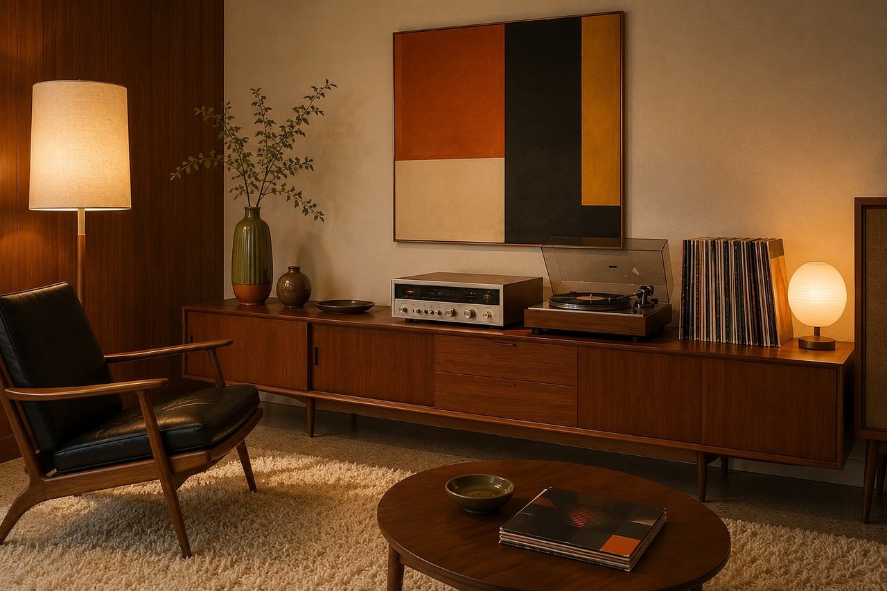
For a practical example, the Eos 71-inch Tambour Door TV Stand uses multi-layer solid walnut with a tambour rolling door. The wood’s natural grain runs continuously through the slats, and the finish has enough depth that the surface reads warm even under cool LED ceiling lights. The tambour door adds a textural element that a flat-panel door can’t match. It arrives fully assembled, which means the grain alignment and door tracking are already dialed in at the factory rather than left to whatever skills you have with an Allen wrench.
How Do Proportion and Silhouette Shape Appeal?
Leg Style and Base Architecture
The base of a TV stand changes how the whole piece reads. Four splayed legs give a mid-century feel that’s light and airy. A solid plinth base reads grounded and architectural. Hairpin legs add industrial character. Wall-mounted floating consoles make the floor visible underneath, which makes small rooms feel larger.
I’ve seen the same cabinet body paired with different legs and it completely changes the personality. A walnut cabinet on splayed legs looks like it belongs in a Palm Springs living room. The same cabinet on a solid base looks like it belongs in a Manhattan apartment. The body is identical. The leg does all the work.
The joinery between leg and body matters too. Legs that are integrated into the frame, rather than bolted on underneath, read as part of the design. Bolt-on legs always look like an afterthought, because they are.
Visual Weight vs. Actual Weight
There’s a difference between how heavy a piece looks and how heavy it actually is. A well-designed stand uses proportion to manage visual weight. A thick top with thin legs looks substantial without feeling bulky. A thin top on a heavy base looks top-heavy and precarious.
Floating consoles are the extreme example. They have real weight, often 80-plus pounds, but zero visual footprint on the floor because nothing touches the ground. That visual lightness lets you use a larger piece in a smaller room without it overwhelming the space.
The ratio that matters most is the base-to-body ratio. If the base is wider than the body, the piece looks stable and grounded. If the base is narrower, it looks lifted and dynamic. Neither is wrong, but they create very different moods. A stand with unique visual appeal uses this ratio intentionally rather than defaulting to whatever the factory had in stock.

Why Does Construction Quality Show — Even From Across the Room?
Seamless Joints and Continuous Grain
When a TV stand is built in one piece at a factory, the wood grain can run continuously from one panel to the next. The joints between panels are tight and nearly invisible. When the same stand ships flat and gets assembled at home with cam locks and dowels, the grain alignment depends on the assembler’s care and patience, and the joints are visible gaps.
This is the core argument for fully assembled furniture: the visual quality is structural, not cosmetic. You can’t sand and refinish a joint gap at home. You can’t realign grain that was cut from different boards. The factory controls all of that, and the difference shows up in the first five seconds of looking at the piece.
I helped a friend assemble a flat-pack console last year. We spent two hours on it, and by the end, one door sat a quarter-inch lower than the other. The gap was visible from across the room. The same design built and aligned at the factory would have looked completely different.
Hardware That Disappears vs. Hardware That Distracts
Good hardware design means you don’t notice the hardware. Hinges are concealed. Door pulls are integrated or absent. Drawer slides are soft-close and hidden behind the face frame. The piece reads as a continuous surface.
Cheap hardware announces itself. Cam lock covers pop out over time. Visible bracket mounts on floating consoles break the floating illusion. Hinge barrels stick out past the door edge. These are small details individually, but together they make a piece look assembled rather than designed.
Cable management is part of this too. A stand with built-in routing channels and a back panel with cutouts keeps wires invisible. If you’re dealing with a mess of cables, hide TV cables and wires with TV stand walks through specific solutions for different stand types.
What Separates a Memorable TV Stand From a Generic One?
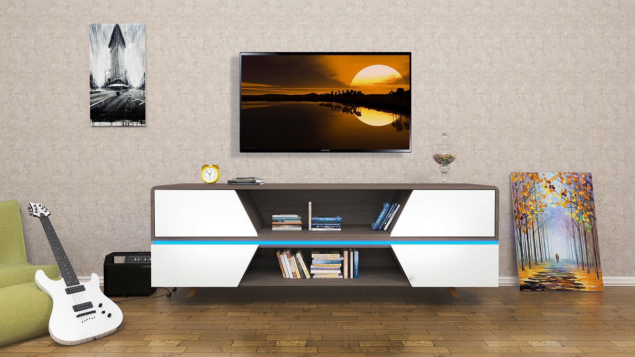
A memorable TV stand has at least one design element that a generic stand doesn’t. Here’s a side-by-side comparison:
| Trait | Generic stand | Memorable stand |
|---|---|---|
| Material | Single material, usually MDF with veneer | Mixed materials that complement each other |
| Finish | Flat, uniform, reads as a photo of wood | Depth and texture, reads as real wood |
| Proportion | Standard box shape, no base variation | Considered silhouette, intentional leg or base choice |
| Joints | Visible seams at panel breaks | Continuous grain, tight or invisible joints |
| Hardware | Functional but visible, cam locks exposed | Concealed or integrated, no visible fasteners |
| Detail | No secondary design elements | One element that draws the eye: tambour door, stone top, LED integration |
The right column describes a piece with unique visual appeal. The left column describes a piece that holds a TV. Both are functional. Only one is worth looking at.
According to a 2024 Houzz study, living rooms remain the most renovated room in American homes (Houzz & Home Study, 2024), and media consoles are among the top five most-purchased furniture pieces for those renovations. Buyers are spending real money on this category, which makes understanding the difference between generic and memorable practical, not just aesthetic. When you’re investing in a piece you’ll see every day, the design details are what determine whether you still like it in three years.
If you want to see what memorable looks like in practice, povison top 10 TV stand reviews breaks down specific models that hit these design criteria across different styles and price ranges.
Design Styles That Naturally Command Attention
Sculptural and Asymmetrical Forms
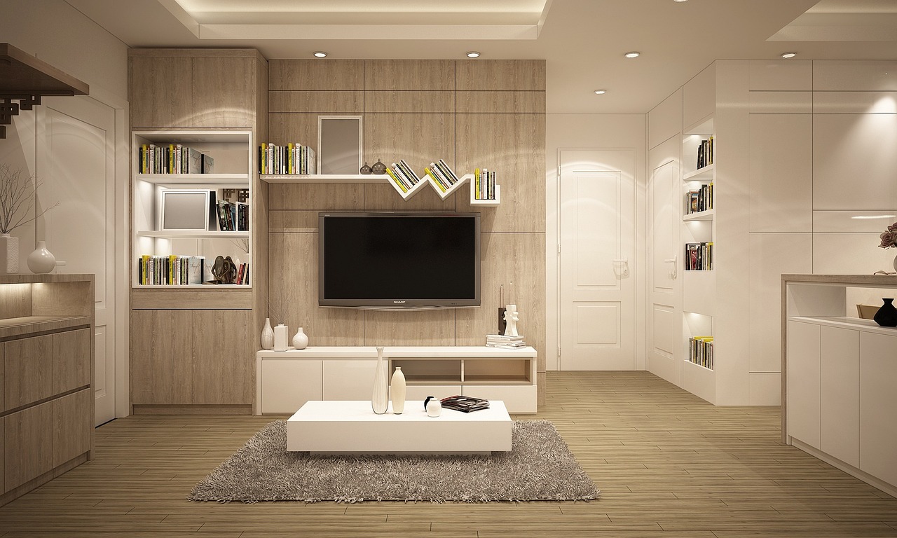
A TV stand doesn’t have to be a symmetric box. Asymmetrical designs, where the body shifts off-center or one side extends further than the other, create visual tension that draws the eye. Sculptural forms with curved edges or angled fronts break the expected rectangle and make the piece feel intentional rather than purely functional.
The risk with asymmetry is that it can look unbalanced if the TV itself is centered on the wall above it. The solution is to treat the stand and the wall around it as a composition. An off-center stand paired with a tall plant or a piece of art on the opposite side creates a balanced arrangement that’s more interesting than a perfectly centered setup.
Mixed-Material Compositions
Combining two or three materials in one piece is one of the most reliable ways to create visual interest. Wood and stone, metal and glass, or walnut and white lacquer each create a contrast that single-material designs can’t achieve. The key is choosing materials with different visual temperatures: warm wood paired with cool stone, or soft fabric paired with hard metal.
How to Match Visual Appeal to Your Room’s Personality
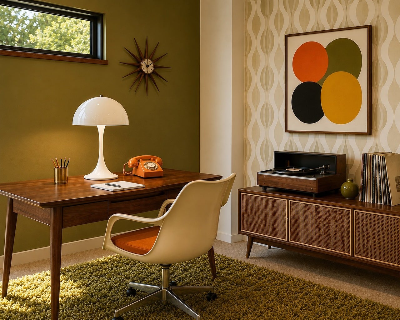
Start with the room’s existing color palette. If your walls are white and your furniture is light oak, a dark walnut stand creates a deliberate focal point. If the room already has dark tones, a matching dark stand might disappear or make the space feel heavy. Sometimes the right move is contrast: a light stone-topped stand in a dark room draws the eye exactly where you want it.
Consider the room’s scale. In a small living room, a floating console keeps the floor visible and makes the space feel larger. In a large room with high ceilings, a low, wide grounded console fills the wall without competing with the ceiling height. The stand should relate to the wall behind it, not just the TV on top of it.
Think about how you use the space. If the TV area is your primary hangout spot, the stand needs storage for devices and games, which means closed cabinetry matters. If the room is more formal and the TV gets used occasionally, an open-shelf design with a few curated objects looks cleaner. The stand’s unique visual appeal has to survive contact with your actual life, not just look good in a staged photo.
For specific styling ideas once you’ve chosen a stand, how to decorate a TV stand for living room breaks down object placement, height layering, and color coordination in practical terms.
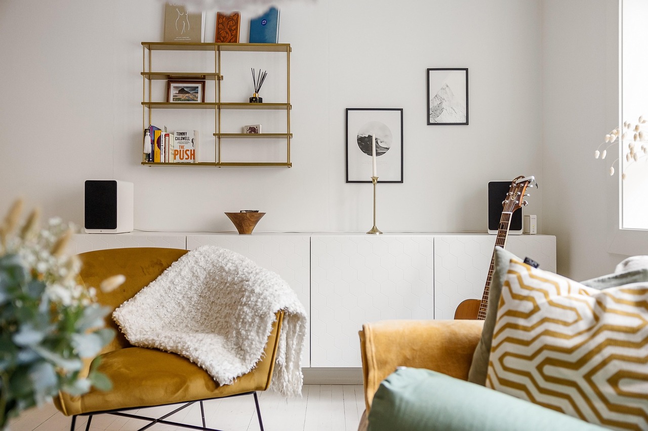
POVISON Picks — TV Stand Unique Visual Appeal: What Sets Great Designs Apart
Three TV stands that pair distinctive material choices with factory-grade construction quality
Ansel 70.87-inch Mid-Century TV Stand
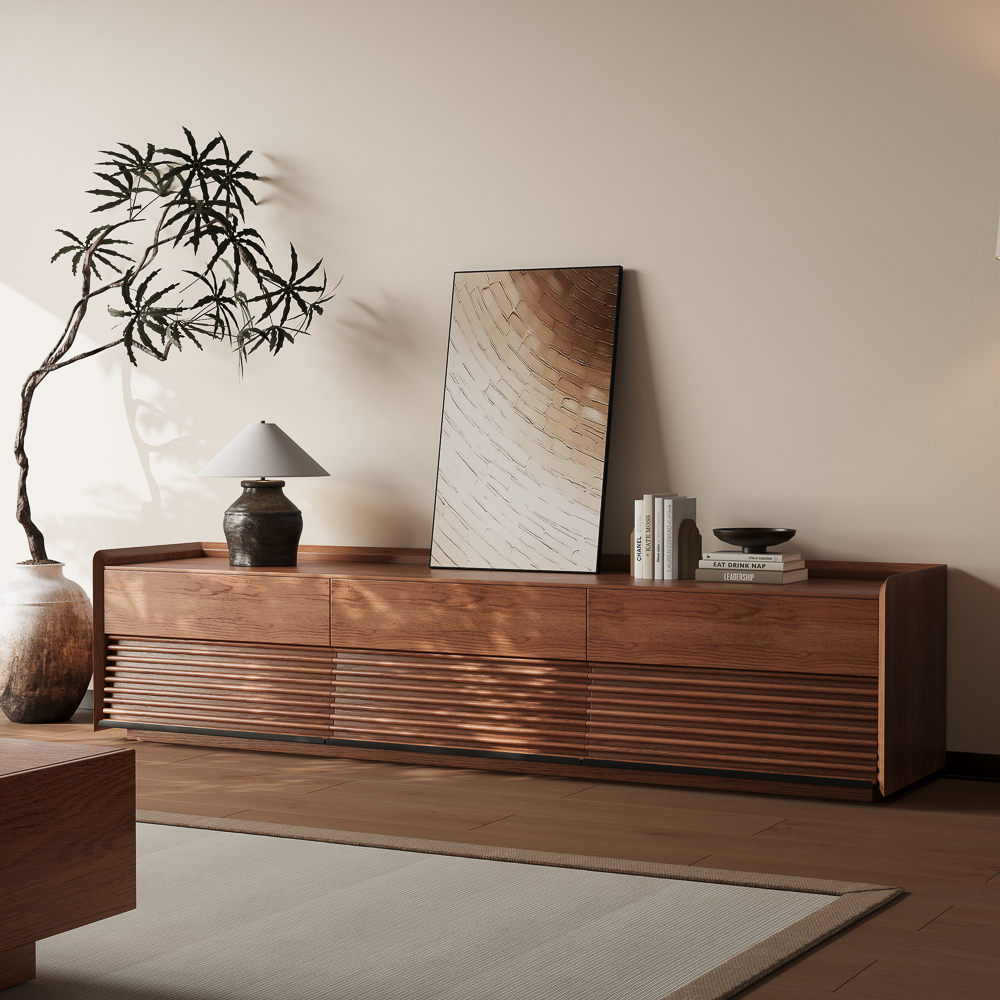
The Ansel stands out for its fluted walnut doors with integrated pulls that keep the front reading as continuous wood texture. At 70.86 x 17.72 x 19.29 inches, it fits 65-inch TVs and arrives fully assembled with the LED channel already factory-routed. The plywood construction in walnut color pairs six drawers of storage with adjustable LED lighting that sits flush in the body rather than stuck on with adhesive. At $1,299 with 111 buyer reviews, it hits the sweet spot between storage capacity and design detail. The fluted door pattern catches light differently throughout the day, giving the piece a visual depth that flat-front cabinets can’t match.
Nice as the picture. Smooth delivery and assembly by appointment. Looks great in our basement 115” TV
Customer review by Kary DiRocco (March 11, 2026)
63-inch Black Floating TV Stand
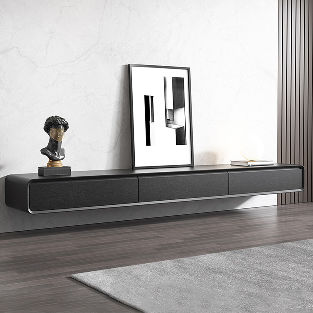
This floating console is the clearest example of visual weight management on the list. Wall-mounted at 62.99 x 14.57 x 9.84 inches, it keeps the floor completely visible underneath, making it the go-to pick for small living rooms where a floor-standing cabinet would eat too much space. The MDF body in black finish with rubber wood construction and walnut veneer on three pinewood doors creates a warm-meets-cool material contrast. It arrives fully assembled and holds up to 110 pounds. At $699 with 386 buyer reviews, it’s the most reviewed and most affordable pick. The floating silhouette creates a visual lightness that grounded cabinets simply can’t achieve.
Was delivered in a very good packaging in a professional manner. Very well built and excellent finishing. Strong and looks very elegant, very impressive.
Customer review by Patel (July 22, 2025)
71-inch Mid-Century Modern TV Stand
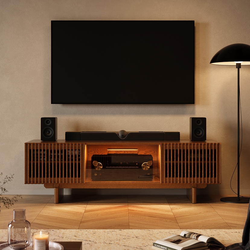
The widest pick at 70.9 x 22 x 22 inches, this stand pairs a deeper top surface with substantial storage. The plywood construction in walnut color holds up to 250 pounds on the desktop and features fluted front panels that add tactile texture. Legs attach on arrival (partial assembly, legs only) while the body ships factory-built. At $1,699 with 27 buyer reviews, it’s the premium option for larger rooms where a 71-inch width can anchor a wall without looking undersized. The extra depth gives it a grounded silhouette that works in open-concept spaces where the TV area shares the room with other zones.
We are absolutely THRILLED with our 71″ Mid-Century TV Stand with Storage in a gorgeous solid walnut. It is a beautiful piece of furniture.
What makes this piece even more brilliant is that the side compartment shelves can be removed, leaving enough room in the compartments to fit our speakers inside. There was still room left to add other components on top of the speakers.
What was an unattractive, chaotic TV setup is now transformed into an organized, functional, and elegant corner in our home.
Customer review by Victoria Allen (June 14, 2026)
Conclusion
A TV stand with unique visual appeal is not an accident. It comes from specific, identifiable choices: material with real character, finish with genuine depth, proportion that suits the room, and construction quality that holds up to close inspection. When you know what to look for, you can evaluate any stand in a few seconds and tell whether it has real design intent or is just a box with legs. That knowledge is worth more than any brand name or price tag, because it means you’ll buy something you actually want to look at every day.
Q&A
How can you tell if a TV stand uses real wood instead of a printed veneer?
Real wood features natural grain patterns that shift and catch the light depending on your viewing angle. Printed veneers look flat and uniform because they repeat the same pattern. You can also look at the edges of the panels to see if the grain wraps continuously around the corners.
Does a floating TV stand work better in small living rooms?
Yes, a floating console is an excellent choice for small spaces because it keeps the floor visible underneath. This creates an illusion of more square footage and makes the room feel less cluttered than a heavy cabinet sitting directly on the floor.
Why does a fully assembled TV stand look better than a flat pack option?
Fully assembled furniture allows for continuous grain alignment and seamless joints that you simply cannot achieve with a flat pack kit. When pieces are built in a factory, the construction quality is structural rather than cosmetic, meaning you avoid visible cam locks and awkward gaps.
How do you balance an asymmetrical TV stand in your living room?
You can balance an asymmetrical design by treating the stand and the surrounding wall as a single composition. Try placing a tall plant or a piece of framed art on the opposite side of the extended section to create visual equilibrium rather than forcing the TV off center.
Should your TV stand match the color of your existing furniture?
It is not always necessary to match your existing furniture exactly. Sometimes choosing a contrasting material works better. If you have a room with dark tones, a light stone topped stand can draw the eye and create a deliberate focal point rather than blending into the background.


